Course
Clearfix
CSS Tutorial
This CSS tutorial is designed for beginners to navigate through the essentials and intricate aspects of CSS styling. Upon finishing this tutorial, participants will possess a comprehensive understanding of CSS, setting a solid foundation for further exploration and mastery. This guide aims to equip you with the skills necessary to transform your visions into visually appealing web designs, laying the groundwork for your journey towards becoming an accomplished web designer.
Clearfix
Clearfix is a technique to ensure that a container properly encloses and contains floated elements within it. It prevents layout issues by adding an empty element to the container, which clears both left and right floats, allowing the container to expand and maintain its intended layout.
Clearfix helps to prevent the problems like container collapse, uneven heights, overlapping content, inconsistent alignment.
This chapter will explore, how the clearfix technique ensures that container elements properly contains its floated child elements.
As mentioned above ,the CSS clearfix fixes the overflow elements from the desired element. The following three properties can be worked upon for this:
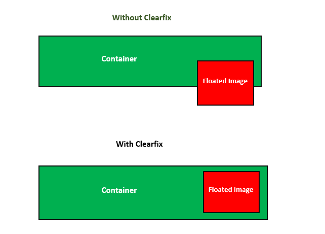
The following diagram demonstrates the clearfix layout for reference:
CSS Clearfix - With overflow & float Property
Let us see an example where an image is larger than its container's height, causing the image to extend beyond the boundaries of its container and potentially disrupting the layout.
<html><head><style> div { border: 2px solid #f0610e; padding: 5px; background-color: #86f00e; } .tutimg { float: right; border: 3px solid #f0610e; }</style></head><body> <h2>Without clearfix</h2> <div> <img class="tutimg" src="images/tutimg.png" width="200" height="200"> There are many variations of passages of Lorem Ipsum available, but the majority have suffered alteration in some form, by injected humour, or randomised words which don't look even slightly believable. If you are going to use a passage of Lorem Ipsum, you need to be sure there isn't anything embarrassing hidden in the middle of text. All the Lorem Ipsum generators on the Internet tend to repeat predefined chunks as necessary, making this the first true generator on the Internet. </div></body></html>CSS Clearfix - With overflow Property
To resolve this overflow, we can set overflow: auto; property to the corresponding element, ensuring that the image is fully contained within the container.
<html><head><style> div { border: 2px solid #f0610e; padding: 5px; background-color: #86f00e; } .tutimg { float: right; border: 3px solid #f0610e; } .custom-clearfix { overflow: auto; }</style></head><body> <h2>With clearfix</h2> <div class="custom-clearfix"> <img class="tutimg" src="images/tutimg.png" width="200" height="200"> There are many variations of passages of Lorem Ipsum available, but the majority have suffered alteration in some form, by injected humour, or randomised words which don't look even slightly believable. If you are going to use a passage of Lorem Ipsum, you need to be sure there isn't anything embarrassing hidden in the middle of text. All the Lorem Ipsum generators on the Internet tend to repeat predefined chunks as necessary, making this the first true generator on the Internet. </div></body></html>CSS Clearfix - With height Property
You can also acheive clearfix by setting the height of <div> element similar to the height of the floated image.
<html><head><style> div { border: 2px solid #f0610e; padding: 10px; height: 120px; background-color: #86f00e; } .tutimg { float: right; border: 3px solid #f0610e; }</style></head><body> <div> <img class="tutimg" src="images/tutimg.png" width="120" height="120"> There are many variations of passages of Lorem Ipsum available, but the majority have suffered alteration in some form, by injected humour, or randomised words which don't look even slightly believable. If you are going to use a passage of Lorem Ipsum, you need to be sure there isn't anything embarrassing hidden in the middle of text. All the Lorem Ipsum generators on the Internet tend to repeat predefined chunks as necessary, making this the first true generator on the Internet. </div></body></html>CCS Clear Property
The clear CSS property affects the float concept by moving elements past it instead of having them move up to take the space available. The clear property applies to floating and non-floating elements.
Possible values are:
- none: Is a keyword indicating that the element is not moved down to clear past floating elements.
- left: Is a keyword indicating that the element is moved down to clear past left floats.
- right: Is a keyword indicating that the element is moved down to clear past right floats.
- both: Is a keyword indicating that the element is moved down to clear past both left and right floats.
- inline-start: Is a keyword indicating that the element is moved down to clear floats on start side of its containing block, that is the left floats on ltr scripts and the right floats on rtl scripts.
- inline-end: Is a keyword indicating that the element is moved down to clear floats on end side of its containing block, that is the right floats on ltr scripts and the left floats on rtl scripts.
CSS clear - left Value
Following example demonstrates clearfix using clear:left property:
<html><head><style> .mainbody{ border: 1px solid black; padding: 10px; } .left { border: 1px solid black; clear: left; } .aqua{ float: left; margin: 0; background-color: aqua; color: #000; width: 20%; } .pink{ float: left; margin: 0; background-color: pink; width: 20%; } p { width: 50%; } </style></head><body> <div class="mainbody"> <p class="aqua"> There are many variations of passages of Lorem Ipsum available, but the majority have suffered alteration in some form, by injected humour, or randomised words which don't look even slightly believable. If you are going to use a passage of Lorem Ipsum, you need to be sure there isn't anything embarrassing hidden in ton the Internet. </p> <p class="pink">Lorem ipsum dolor sit amet, consectetuer adipiscing elit.</p> <p class="left">This paragraph clears left.</p></div></body></html>CSS clear - right Value
Following example demonstrates clearfix using clear:right property:
<html><head><style> .mainbody{ border: 1px solid black; padding: 10px; } .right { border: 1px solid black; clear: right; } .aqua{ float: right; margin: 0; background-color: black; color: #fff; width: 20%; } .pink{ float: right; margin: 0; background-color: pink; width: 20%; } p { width: 50%; } </style></head><body> <div class="mainbody"> <p class="aqua"> There are many variations of passages of Lorem Ipsum available, but the majority have suffered alteration in some form, by injected humour, or randomised words which don't look even slightly believable. If you are going to use a passage of Lorem Ipsum, you need to be sure there isn't anything embarrassing hidden in ton the Internet. </p> <p class="pink">Lorem ipsum dolor sit amet, consectetuer adipiscing elit.</p> <p class="right">This paragraph clears right.</p></div></body></html>CSS clear - both Value
Following example demonstrates clearfix using clear:both property:
<html><head><style> .mainbody{ border: 1px solid black; padding: 10px; } .both { border: 1px solid black; clear: both; } .aqua{ float: left; margin: 0; background-color: black; color: #fff; width: 20%; } .pink { float: right; margin: 0; background-color: pink; width: 20%; } p { width: 45%; } </style></head><body> <div class="mainbody"> <p class="aqua"> There are many variations of passages of Lorem Ipsum available, but the majority have suffered alteration in some form, by injected humour, or randomised words which don't look even slightly believable. If you are going to use a passage of Lorem Ipsum, you need to be sure there isn't anything embarrassing hidden in ton the Internet. </p> <p class="pink">Lorem ipsum dolor sit amet, consectetuer adipiscing elit.</p> <p class="both">This paragraph clears both.</p></div></body></html>