Course
Introduction
CSS Tutorial
This CSS tutorial is designed for beginners to navigate through the essentials and intricate aspects of CSS styling. Upon finishing this tutorial, participants will possess a comprehensive understanding of CSS, setting a solid foundation for further exploration and mastery. This guide aims to equip you with the skills necessary to transform your visions into visually appealing web designs, laying the groundwork for your journey towards becoming an accomplished web designer.
RWD Introduction
Responsive Web Design (RWD) is a web-designing and development approach that makes the web pages render well and correctly on various devices with different screen sizes and resolutions.
The motive of responsive web design is to ensure that the user experience is consistent and optimized regardless of whether the website is viewed on a mobile device, a desktop computer, laptop, or a tablet.
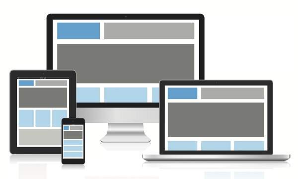
RWD Structure
The following figure describes the structure of responsive web designing, where the same page can be viewed optimally on different kinds of devices of varied sizes and resolutions.
Cascading Style Sheets (CSS) plays a crucial role in responsive web designing. Following are few of the concepts and techniques that are used in CSS for responsive web designing:
- Media Queries: Media queries allow you to apply CSS rules based on characteristics of the device, such as its screen width, height, or even its orientation (landscape or portrait). By using media queries, you can define different styles for different devices.
- Flexible Grid Layouts: Instead of using fixed-width layouts, responsive designs often use flexible grid layouts. CSS frameworks like Bootstrap provide grid systems that automatically adjust the layout based on the screen size.
- Viewport Meta Tag: The viewport meta tag is used in the HTML <head> to control the viewport behavior and scale on mobile devices. It is crucial for ensuring proper rendering on various screen sizes.