Teachnique
      CourseRoadmaps
      Login

      IntroductionSyntaxSelectorsInclusionMeasurement UnitsColorsBackgroundsFontsTextImagesLinksTablesBordersBorder BlockBorder InlineMarginsListsPaddingCursorOutlinesDimensionScrollbarsInline BlockDropdownsVisibilityOverflowClearfixFloatArrowsResizeQuotesOrderPositionHyphensHoverDisplayFocusZoomTranslateHeightHyphenate CharacterWidthOpacityZ-IndexBottomNavbarOverlayFormsAlignIconsImage GalleryCommentsLoadersAttr SelectorsCombinatorsRootBox ModelCountersClipWriting ModeUnicode-bidimin-contentAllInsetIsolationOverscrollJustify ItemsJustify SelfTab SizePointer EventsPlace ContentPlace ItemsPlace SelfMax Block SizeMin Block SizeMix Blend ModeMax Inline SizeMin Inline SizeOffsetAccent ColorUser Select

      GridGrid LayoutFlexboxVisibilityPositioningLayersPseudo ClassesPseudo Elements@ RulesText EffectsPaged MediaPrintingLayoutsValidationsImage SpritesImportantData Types

      TutorialRounded CornerBorder ImagesMulti BackgroundColorGradientsBox ShadowBox Decoration BreakCaret ColorText ShadowText2d transform3d transformTransitionAnimationMulti columnsBox SizingTooltipsButtonsPaginationVariablesMedia QueriesFunctionsMath FunctionsMaskingShapesStyle ImagesSpecificityCustom Properties

      IntroductionViewportGrid ViewMedia QueriesImagesVideosFrameworks

      Questions and AnswersQuick GuideReferencesColor ReferencesWeb browser ReferencesWeb safe fontsUnitsAnimation

      PX to EM converterColor Chooser & Animation

      Useful ResourcesDiscussion

      Feedback

      Submit request if you have any questions.

      Course
      Rounded Corner

      CSS Tutorial

      This CSS tutorial is designed for beginners to navigate through the essentials and intricate aspects of CSS styling. Upon finishing this tutorial, participants will possess a comprehensive understanding of CSS, setting a solid foundation for further exploration and mastery. This guide aims to equip you with the skills necessary to transform your visions into visually appealing web designs, laying the groundwork for your journey towards becoming an accomplished web designer.

      Rounded Corners

      
      CSS rounded corners are created using the border-radius property. This property allows you to specify the radius of the corners of an element's outer border edge.

      Possible Values

      • <length>: Size of circle radius is denoted, using length values. Negative values are not valid.
      • <percentage>: Size of circle radius is denoted, using percentage values.
      • Horizontal axis percentage is referred to the width of the box.
      • Vertical axis percentage is referred to the height of the box.
      • Negative values are not valid.

      Applies to

      All the HTML elements, except for table and inline-table elements with border-collapse set to collapse. Applies to ::first-letter.

      DOM Syntax

      object.style.borderRadius = "length";
      The following diagram demonstrates the different border-radius corners for reference:
      
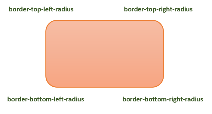
      The following table shows the possible values for rounded corners as follows
      Value
      
      Description
      radius
      
      Is a <length> or a <percentage> that sets the radius for all four corners of the element. It is used only in the one-value syntax.
      top-left and bottom-right
      
      Is a <length> or a <percentage> that sets the radius for the top-left and bottom-right corners of the element. It is used only in the two-value syntax.
      top-right and bottom-left
      
      Is a <length> or a <percentage> that sets the radius for the top-right and bottom-left corners of the element. It is used only in the two- and three-value syntaxes.
      top-left
      
      Is a <length> or a <percentage> that sets the radius for the top-left corner of the element. It is used on three and four value syntaxes.
      top-right
      
      Is a <length> or a <percentage> that sets the radius for the top-right corners of the element. It is used only in the four-value syntax.
      bottom-right
      
      Is a <length> or a <percentage> that sets the radius for the bottom-right corners of the element. It is used only in the three and four-value syntaxes.
      bottom-left
      
      Is a <length> or a <percentage> that sets the radius for the bottom-left corners of the element. It is used only in the four-value syntax.
      Individual border radius properties, such as border-top-left-radius, cannot inherit from their parent element. Instead, you must use the individual longhand properties to set the border radius of each corner.

      CSS Border Radius - Length Value

      The following example demostrates how to use the border-radius property to create rounded corners for all four corners of a box
      <html>
      <head>
      <style>
      .rounded-box {
      width: 200px;
      height: 100px;
      background-color: pink;
      line-height: 100px;
      border-radius: 20px;
      }
      </style>
      </head>
      <body>
      <div class="rounded-box">
      This is a rounded corner box.
      </div>
      </body>
      </html>
      You can use the border-radius property to create rounded corners on box, borders, and images.
      Here is an example
      <html>
      <head>
      <style>
      .rounded-box {
      width: 200px;
      height: 100px;
      background-color: pink;
      border-radius: 20px;
      margin-bottom: 10px;
      }
      .border-box {
      width: 200px;
      height: 100px;
      border-radius: 2em;
      border: 3px solid green;
      margin-bottom: 20px;
      }
      .img-border-radius {
      background-image: url(images/tree.jpg);
      background-size: 100% 100%;
      border-radius: 20%;
      width: 200px;
      height: 150px;
      }
      </style>
      </head>
      <body>
      <div class="rounded-box">
      This is a rounded corner box.
      </div>
      <div class="border-box">
      This is a rounded corner box.
      </div>
      <div class="img-border-radius">
      This is a rounded corner image.
      </div>
      </body>
      </html>
      You can use the border-radius property to create different rounded corner styles on an element.
      Here is an example
      <html>
      <head>
      <style>
      .rounded-box {
      width: 200px;
      height: 100px;
      background-color: pink;
      margin: 10px;
      padding: 5px;
      }
      .rounded-box.tl {
      border-radius: 30px 0 0 0;
      }
      .rounded-bo x.tr {
      border-radius: 0 2em 0 0;
      }
      .rounded-box.bl {
      border-radius: 0 0 0 15%;
      }
      .rounded-box.br {
      border-radius: 0 0 30px 0;
      }
      .rounded-box.tl-br {
      border-radius: 2em 0 2em 0;
      }
      .rounded-box.tr-bl {
      border-radius: 0 15% 0 15%;
      }
      </style>
      </head>
      <body>
      <div class="rounded-box tl">
      top-left rounded corner.
      </div>
      <div class="rounded-box tr">
      top-right rounded corner.
      </div>
      <div class="rounded-box bl">
      bottom-left rounded corner.
      </div>
      <div class="rounded-box br">
      bottom-right rounded corner.
      </div>
      <div class="rounded-box tl-br">
      top-left and bottom-right rounded corners.
      </div>
      <div class="rounded-box tr-bl">
      top-right and bottom-left rounded corners.
      </div>
      </body>
      </html>

      CSS Rounded Corner Images

      You can use the border-radius property to create different rounded corner styles on elements.
      Here is an example
      <html>
      <head>
      <style>
      img {
      width: 200px;
      height: 100px;
      margin: 10px;
      }
      .top-left {
      border-radius: 30px 0 0 0;
      }
      .top-right {
      border-radius: 0 2em 0 0;
      }
      .bottom-left {
      border-radius: 0 0 0 15%;
      }
      .bottom-right {
      border-radius: 0 0 30px 0;
      }
      .tl-br {
      border-radius: 2em 0 2em 0;
      }
      .tr-bl {
      border-radius: 0 15% 0 15%;
      }
      </style>
      </head>
      <body>
      <h4>top-left rounded corner.</h4>
      <img class="top-left" src="images/tree.jpg" />
      <h4>top-right rounded corner.</h4>
      <img class="top-right" src="images/tree.jpg" />
      <h4> bottom-left rounded corner.</h4>
      <img class="bottom-left" src="images/tree.jpg" />
      <h4>bottom-right rounded corner.</h4>
      <img class="bottom-right" src="images/tree.jpg" />
      <h4>top-left and bottom-right rounded corners.</h4>
      <img class="tl-br" src="images/tree.jpg" />
      <h4>top-right and bottom-left rounded corners.</h4>
      <img class="tr-bl" src="images/tree.jpg" />
      </body>
      </html>
      We can create a circle and an ellipse using the CSS border-radius property.
      Here is an example
      <html>
      <head>
      <style>
      .rounded-circle {
      width: 100px;
      height: 100px;
      background-color: pink;
      text-align: center;
      border-radius: 50%;
      }
      .rounded-ellipse {
      width: 200px;
      height: 100px;
      background-color: pink;
      text-align: center;
      border-radius: 50%;
      }
      </style>
      </head>
      <body>
      <div class="rounded-circle">
      circle
      </div>
      <div class="rounded-ellipse">
      ellipse
      </div>
      </body>
      </html>
      

      CSS border-radius - Related Properties

      Following is the list of CSS properties related to border-radius:
      property
      value
      border-top-left-radius
      Sets the roundness of the top-left corner of an element's border.
      border-top-right-radius
      Sets the roundness of the top-right corner of an element's border.
      border-bottom-right-radius
      Sets the roundness of the bottom-right corner of an element's border.
      border-bottom-left-radius
      Sets the roundness of the bottom-left corner of an element's border.
      border-start-start-radius
      Sets the roundness of the block-start and inline-start corner of an element's border.
      border-start-end-radius
      Sets the roundness of the block-start and inline-end corner of an element's border.
      border-end-start-radius
      Sets the roundness of the block-end and inline-start corner of an element's border.
      border-end-end-radius
      Sets the roundness of the block-end and inline-end corner of an element's border.