Teachnique
      CourseRoadmaps
      Login

      IntroductionSyntaxSelectorsInclusionMeasurement UnitsColorsBackgroundsFontsTextImagesLinksTablesBordersBorder BlockBorder InlineMarginsListsPaddingCursorOutlinesDimensionScrollbarsInline BlockDropdownsVisibilityOverflowClearfixFloatArrowsResizeQuotesOrderPositionHyphensHoverDisplayFocusZoomTranslateHeightHyphenate CharacterWidthOpacityZ-IndexBottomNavbarOverlayFormsAlignIconsImage GalleryCommentsLoadersAttr SelectorsCombinatorsRootBox ModelCountersClipWriting ModeUnicode-bidimin-contentAllInsetIsolationOverscrollJustify ItemsJustify SelfTab SizePointer EventsPlace ContentPlace ItemsPlace SelfMax Block SizeMin Block SizeMix Blend ModeMax Inline SizeMin Inline SizeOffsetAccent ColorUser Select

      GridGrid LayoutFlexboxVisibilityPositioningLayersPseudo ClassesPseudo Elements@ RulesText EffectsPaged MediaPrintingLayoutsValidationsImage SpritesImportantData Types

      TutorialRounded CornerBorder ImagesMulti BackgroundColorGradientsBox ShadowBox Decoration BreakCaret ColorText ShadowText2d transform3d transformTransitionAnimationMulti columnsBox SizingTooltipsButtonsPaginationVariablesMedia QueriesFunctionsMath FunctionsMaskingShapesStyle ImagesSpecificityCustom Properties

      IntroductionViewportGrid ViewMedia QueriesImagesVideosFrameworks

      Questions and AnswersQuick GuideReferencesColor ReferencesWeb browser ReferencesWeb safe fontsUnitsAnimation

      PX to EM converterColor Chooser & Animation

      Useful ResourcesDiscussion

      Feedback

      Submit request if you have any questions.

      Course
      Flexbox

      CSS Tutorial

      This CSS tutorial is designed for beginners to navigate through the essentials and intricate aspects of CSS styling. Upon finishing this tutorial, participants will possess a comprehensive understanding of CSS, setting a solid foundation for further exploration and mastery. This guide aims to equip you with the skills necessary to transform your visions into visually appealing web designs, laying the groundwork for your journey towards becoming an accomplished web designer.

      Flexbox layout

      CSS flexbox is a layout model in CSS that provides an efficient and flexible way to arrange and distribute space between items within a container. It arranges elements in a single dimension, either horizontally or vertically, within a container.
      Flexbox organizes elements within a container along a single dimension, which can be either horizontally or vertically aligned.
      This chapter will cover all the properties for managing the positioning, alignment, and gaps between elements along both the main and cross axes.
      The following diagram demonstrates the flexbox layout for reference:
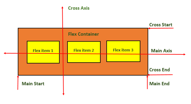
      

      CSS Flexbox Layout

      Create flexbox layout by defining a parent container with the class flexbox-container.
      Let us see an example
      <html>
      <head>
      <style>
      .flex-container {
      display: flex;
      background-color: green;
      }
      .flex-container>div {
      background-color: yellow;
      margin: 10px;
      padding: 15px;
      }
      </style>
      </head>
      <body>
      <div class="flex-container">
      <div>Flex item 1</div>
      <div>Flex item 2</div>
      <div>Flex item 3</div>
      <div>Flex item 4</div>
      </div>
      </body>
      </html>

      CSS Display - Flex

      Flexbox layout uses display: flex property for aligning and distributing elements within a layout container.
      Let us see an example
      <html>
      <head>
      <style>
      .flex-container {
      display: flex;
      background-color: green;
      }
      .flex-container>div {
      background-color: yellow;
      margin: 10px;
      padding: 15px;
      }
      </style>
      </head>
      <body>
      <div class="flex-container">
      <div>Flex item 1</div>
      <div>Flex item 2</div>
      <div>Flex item 3</div>
      </div>
      </body>
      </html>

      CSS Display - Inline-flex

      Flexbox layout can also use display: inline-flex property to create an inline-level flex container, allowing elements to be aligned and distributed within it.
      Let us see an example
      <html>
      <head>
      <style>
      .flex-container {
      display: inline-flex;
      background-color: green;
      }
      .flex-container>div {
      background-color: yellow;
      margin: 10px;
      padding: 15px;
      }
      </style>
      </head>
      <body>
      <div class="flex-container">
      <div>Flex item 1</div>
      <div>Flex item 2</div>
      <div>Flex item 3</div>
      </div>
      </body>
      </html>

      CSS Flexbox Container - Related Properties

      Some of the properties of the flex container are listed as follows
      property
      value
      flex-direction
      Sets the flex direction of the flex items.
      flex-wrap
      Sets whether flex items should wrap onto the next line
      justify-content
      Sets the alignment of flex items along the main axis.
      align-items
      Sets the alignment of flex items along the cross axis.
      align-content
      Sets the alignment and spacing of flex lines within the flex container.
      flex-flow
      Sets both the flex-direction and flex-wrap properties.

      CSS Flexbox Items - Related Properties

      Some of the properties of the flex items are as follows
      property
      value
      flex-grow
      Sets flex item to grow within a flex container.
      flex-shrink
      Sets flex item to shrink in size to fit the available space.
      flex-basis
      Sets the initial size of a flex item.
      flex
      Shorthand property, combines three flex-related properties: flex-grow, flex-shrink, and flex-basis.
      align-self
      Sets the alignment of a specific flex item along the cross-axis.