Course
Border Images
CSS Tutorial
This CSS tutorial is designed for beginners to navigate through the essentials and intricate aspects of CSS styling. Upon finishing this tutorial, participants will possess a comprehensive understanding of CSS, setting a solid foundation for further exploration and mastery. This guide aims to equip you with the skills necessary to transform your visions into visually appealing web designs, laying the groundwork for your journey towards becoming an accomplished web designer.
Border Image
For brevity purpose, there is a shorthand for setting up of border image, i.e., border-image. The values passed to shorthand border-image are separated using the solidus symbol (/). The values should be listed in a specific order, which is slice, then width and last is offset.
Applies to
All HTML elements, except internal table elements.
Syntax
border-image: url('URL'), 40% 25% 20% fill / 12px 5px / 5px space;Note: You can also declare the property border-image with just one value i.e., URL and rest of the values will be default.
Example
Let us see an example:
<html><head><style> .box { width: 200px; height: 200px; border: 20px solid; border-image: url(images/border.png) 30 round; }</style></head><body> <div class="box"></div></body></html>Overview
- The border-image property can be applied to any element, except for the internal table elements (th,tr,td), when border-collapse is set to collapse.
- Only required property for border-image shorthand property is, border-image-source, rest other properties are optional.
- Following are the properties of border-image shorthand, in their order:
- border-image-source: Specifies the source of border-image. Can be a URL, CSS gradient or inline SVG.
- border-image-slice: Allows the slicing up of image by the browser.
- border-image-width: Sets the width of the border image.
- border-image-outset: Pushes the border image outside, beyond the border box.
- border-image-repeat: Repeats the image specified along the sides of the border, until the whole length and width is filled.
border-image-source
The border-image-source property specifies the source of an image to be passed as a border to an element.
Syntax
border: 10px solid; border-image-source: url('URL');border-image-slice
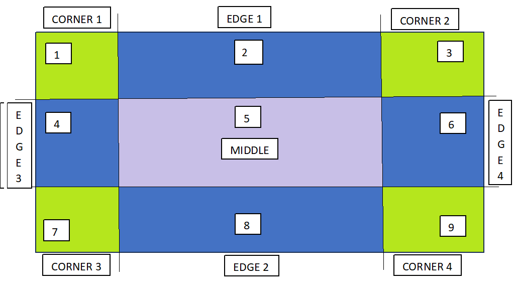
The image specified using the property border-image-source can be sliced using the property border-image-slice.
As the name suggests, this property is used to slice up an image. It divides the image in 9 regions, with 4 corners, 4 edges and a middle region.
The following diagram demonstrates function of border-image-slice property:
Note: Offset for border-image-slice can be provided in terms of percentage and length units. But, percentages are highly recommended.
Refer the following syntax for example:
border: 20px solid; border-image-source: url('URL'); border-image-slice: 25%;border-image-width
To specify the width of the image to be set as a border, you can use the property border-image-width.
Syntax
border: 20px solid; border-image-source: url('URL'); border-image-width: 15px; border-image-slice: 33.33%;border-image-outset
In order to avoid the overlapping of the image borders and the content, you can use the property border-image-outset.
This property pushes the border image outside, beyond the border box.
Syntax
border: 20px solid; padding: 1em; border-image-source: url('URL'); border-image-width: 1; border-image-slice: 10; border-image-outset: 8px;border-image-repeat
By default the border image gets stretched along the sides, but this can be changed, using the property border-image-repeat.
This property repeats the image specified along the sides of the border, until the whole length and width is not filled.
Syntax
border: 20px solid; padding: 1em; border-image-source: url('URL'); border-image-repeat: repeat;It can also take the value as round, apart from stretch and repeat.
CSS Gradient Border Images
CSS gradients can also be used to set the border of an element. Three types of gradients are supported: linear, radial and conic.
Linear Gradient
A linear gradient is used to set a smooth transition between two or more colors along a straight line and the same can be used as a border around an element.
Example
Here is an example:
<html><head><style> img { height: 300px; width: 300px; } img.with-linear-gradient { border-style: solid; border-width: 20px; border-image: linear-gradient(45deg, rgb(15, 64, 161), rgb(228, 6, 17)) 1; }</style></head><body> <div> <img class="with-linear-gradient" src="images/orange-flower.jpg" alt="linear-gradient"/> </div></body></html>Radial Gradient
A radial gradient is used to set a progressive transition between two or more colors that radiate from its origin.
Example
Here is an example:
<html><head><style> img { height: 300px; width: 300px; } img.with-radial-gradient { border-style: solid; border-width: 10px; border-image: radial-gradient(rgb(58, 61, 60), rgb(47, 227, 221)) 1; }</style></head><body> <div> <img class="with-radial-gradient" src="images/orange-flower.jpg" alt="radial-gradient"/> </div></body></html>Conic Gradient
A conic gradient is helpful in creating an image consisting of color transitions rotated around a center point, rather than radiating from the center.
Example
Here is an example:
<html><head><style> img { height: 300px; width: 300px; } img.with-conic-gradient { border-style: solid; border-width: 15px; border-image: conic-gradient(red, yellow, green, aqua, blue, pink, red) 1; }</style></head><body> <div> <img class="with-conic-gradient" src="images/orange-flower.jpg" alt="conic-gradient"/> </div></body></html>All the properties related to border-image are listed in the table below: